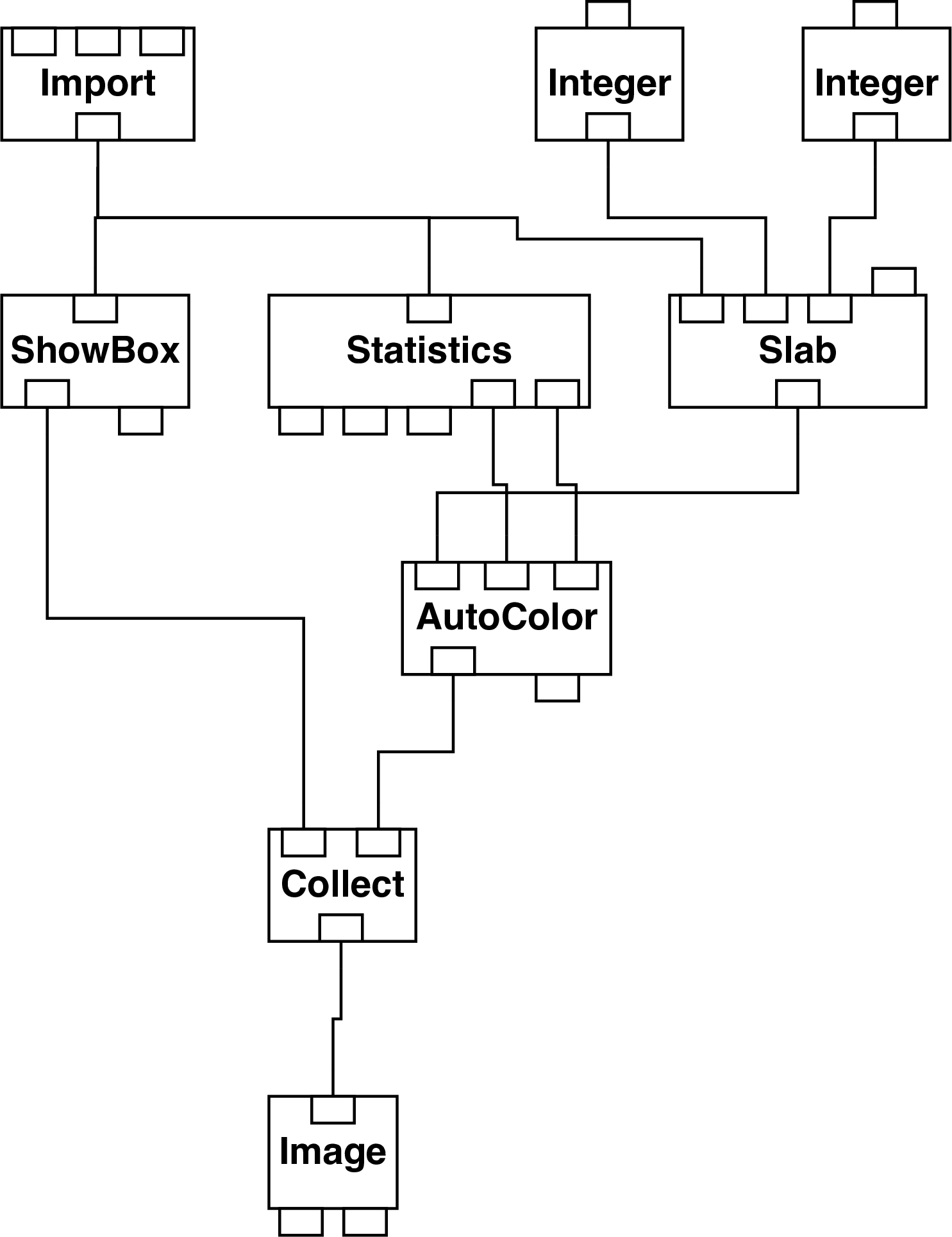
Figure 11: Network to display a slice through a data cube.
| file: | slice.net |
| example data file: | field.general |
This network displays a two-dimensional slice through a data cube, parallel to two of the axes. The slice is plotted as a false colour array shown in its correct relative position inside a set of axes representing the edges of the data cube. Note that the colour table for converting data values into displayed colours is derived from the range of values in the entire data cube, not just the slice being plotted, in order to facilitate the comparison of several slices.
The network is shown in Figure 11.
Module ‘ShowBox’ extracts the bounding box of the data cube. ‘Slab’ extracts the specified slice. ‘Statistics’ finds the minimum and maximum values in the cube; they are used by ‘AutoColor’ to generate a false colour image of the extracted slice. ‘Collect’ combines the bounding box and extracted slice.
If your data are in Starlink NDF format then an alternative way to plot a slice is to use
command DISPLAY in KAPPA (see SUN/95[8]). You simply specify the required slice, for
example:
DISPLAY ndf_file(„21)
plots the twenty-first slice in the third axis.