Display image
sections of a cube
" window enables you to navigate the time axis.Raw ACSIS data follow this naming convention:
aUTDATE_OBSNUMBER_SUBSYSTEM_SUBSCAN
For example, a20131115_00055_03_0001.sdf. The first ‘a’ represents ACSIS. The UT date and observation
number (OBSNUM) serve as an identifier for any given night of observing. ACSIS observations may include up
to eight frequency settings given by the different subsystems (01–08, or 00 in very old data), while long
observations may require multiple subscans to avoid an excessive file size (currently 384 GB, previously
512 GB).
Within each data file each receptor is named. The naming system is zero-based. For HARP the receptor are labelled: H00, H01, H03... H015. For the Nāmakanui inserts the names follow:
Instrument_Insert_Polarisation_Sideband
For example ‘Ū‘ū receptors are: NU0L, NU0U, NU1L, NU1U, with U denoting the insert. For ‘Āweoweo, W denotes the insert: e.g. NW0L, NW0U, NW1L, NW1U; and for ‘Ala‘ihi, A denotes the insert.
Use the Starlink application Gaia to visualise your raw data. The is initiated by:
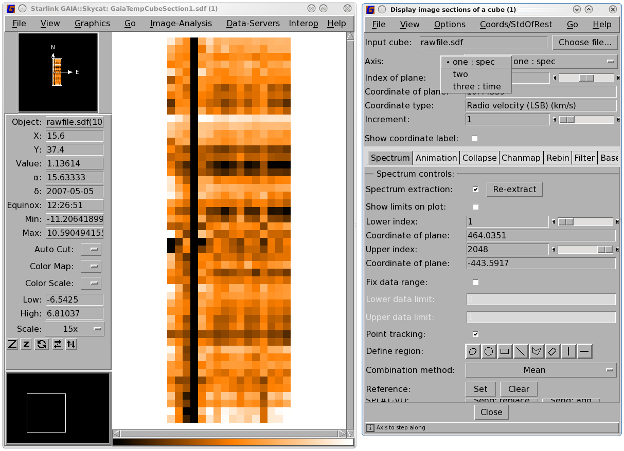
Loading a file in Gaia produces two to three windows (see Figure 4.1 and
Figure 4.2). The main window shows a map of the HARP receptors (along the
x-axis;
note the 16 pixels) for a given sample of the observation (time on the
y-axis).
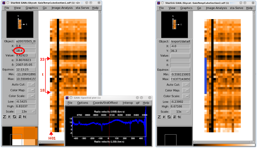
You can track the performance of an individual receptor by following a column from bottom to top to check its
consistency. In Figure 4.1 H03 is dead for the whole observation. The spectrum for a receptor at one
of the time slices can be seen by clicking on the pixel. This will bring up another window—the
"Spectral plot" (see Figure 4.3). This spectrum will be replaced when you click on a different
pixel.
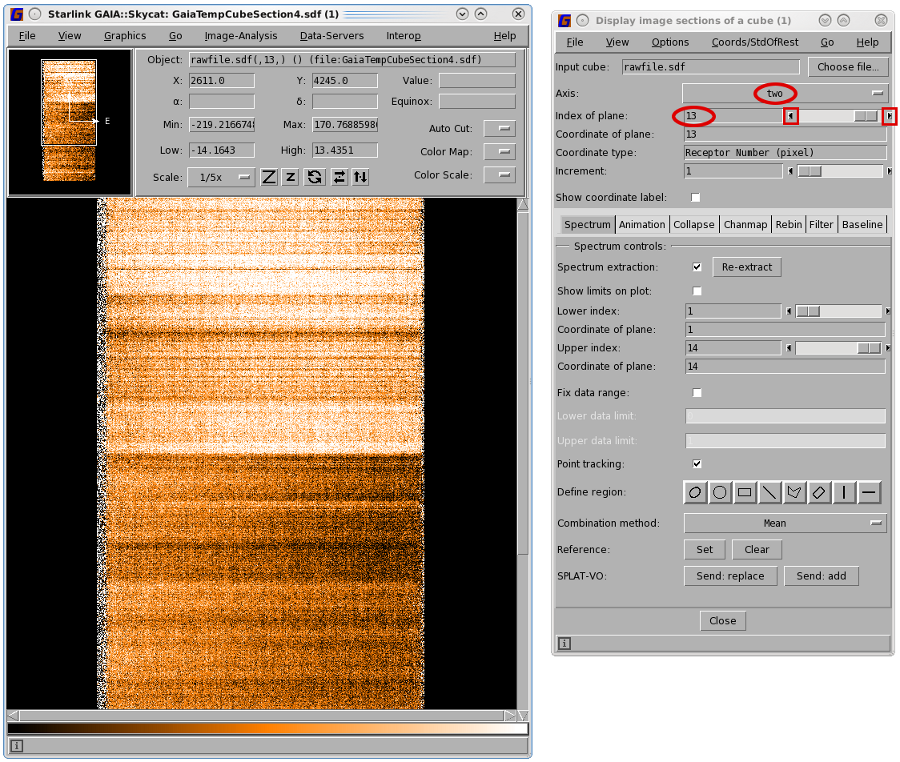
You can change the way the data is displayed in the "Display image sections of a cube" window by
changing the Axis. Selecting Axis number two will display spectra against time while Axis number three
gives spectra against receptors. You can scroll through your data by moving the Index of plane
slider.

Display image
sections of a cube" window enables you to navigate the time axis.
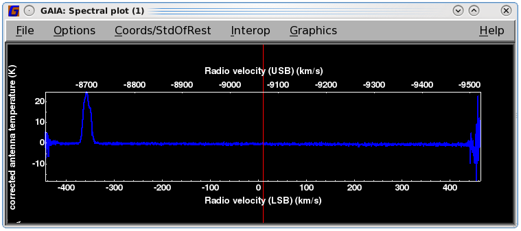
Spectral plot" window displaying its time-varying signal, appears automatically
once a pixel is clicked in the main window. The vertical red line indicates the time slice that is
currently selected in the "Display image sections of a cube" window. This can be dragged across
the spectrum to scroll through the spectra. Examine exposure time map etc. in ancillary arrays.A second way to scroll through your spectrum is to click and drag the vertical red bar on the "Spectral plot"
window. As you do so array shown in the main window will automatically update.
You will likely want to change the auto cut of the colour scale, the colour scheme and the zoom factor—all of which are controlled by buttons on the sidebar in the main window.
See the Gaia manual for full details.
You can mask bad receptors in the time-series data with the Kappa command chpix. In the HARP example
below all data for Receptors 7 and 8 (on the second axis) are turned off by setting them to BAD. Note the
commas in the SECTION parameter which specify which axis is being referred to; here the first (spectra) and third
(time) axes are unchanged so no range is defined. You will have to repeat the command for non-contiguous
receptor numbers.
You can also mask a subset of the time stream for a particular receptor. The example below masks out time Steps 18 to 33 for HARP receptor H01. See Figure 4.4 for instructions on how to identify the affected time range.
Note that the numbering for the HARP receptors here is from 1 to the number of enabled receptors; this is in contrast to numbering from 0 that you may encounter with the pipeline. (You may examine the .MORE.ACSIS.RECEPTORS component of the file with Hdstrace to see which receptors were enabled.)
For jiggle maps, where the receptors do not cover multiple sky positions, bad receptors can be identified in the reduced cubes. For raster maps, however, bad receptors are most easily identified in the time-series data. Once you have opened your raw cube in Gaia it is useful to select the second axis (receptor) which gives spectral dispersion along the x-axis and time along the y-axis. You can use the cube control panel to step through each receptor looking for bad spectra (see Figures 4.4 and 4.5).
